Good UX vs Bad UX

Let’s take a look at some examples of UI/UX which help qualify what I like and dislike in the design world.

1. Teddy Bear
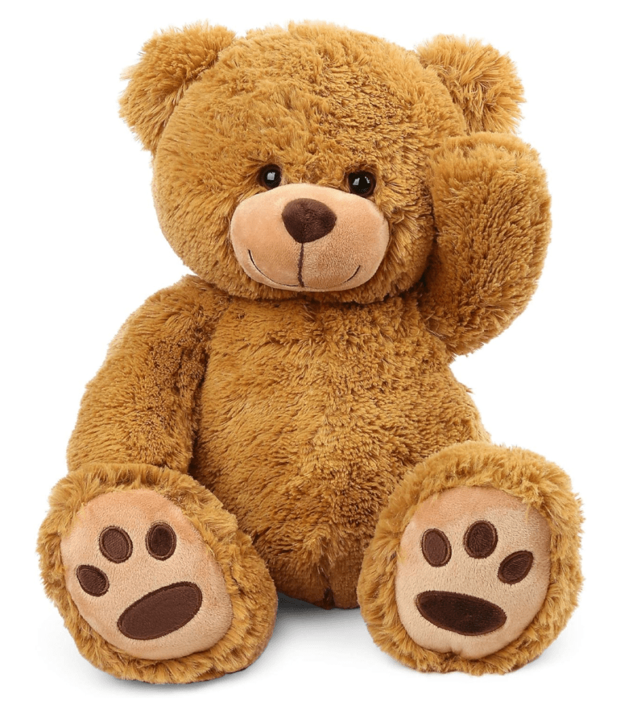
A teddy bear is a great example of very good user experience design. A small child can understand without any instruction that the function of the bear is to be soft and comforting. This intuitive acceptance of purpose speaks to the level of design expertise. 10/10.

2. Cactus

Heres a little piece of bad UX design from nature. The skin of a cactus is coated in sharp needles to ward off any undesired predators. The experience of a cactus to a potential user is universally unpleasant for the user. 2/10 would not recommend.

3. Shazam

Shazam has a beautiful UI and UX. The clean lines and bold lettering makes the visual of the product really appealing and fun to engage with. The single button opens a door into understanding music and introducing you to a whole other level of deeper experiences; concerts near you, music charts, a personal library of music. Very fun to use and works well.

4. Wiki

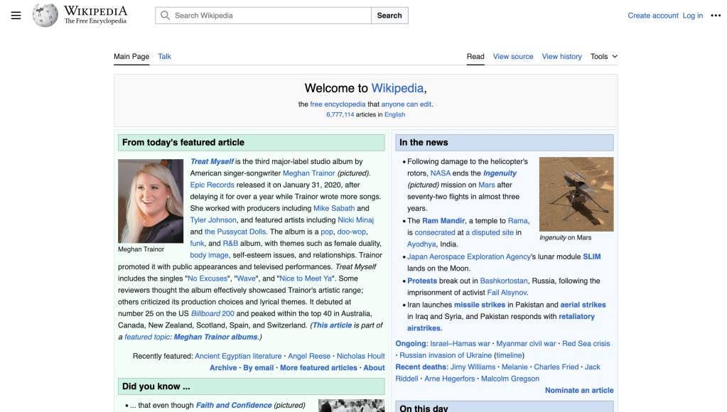
Wikipedia is hardly the worst website design however it just leaves a lot on the table. Bare bones is the best way I could describe my experience. Understanding that the elements of this service which are important is simple text information it makes sense that the UI is lacking however there has to be more than this. 4/10 will keep using.

Leave a comment