LIFE BELOW WATER (BUT MAKE IT SEXY)
I chose the theme of life below water and sustainability of our oceans because the oceans make up 71% of the Earth’s Surface. How could you ignore something so big. My approach was to highlight the essence of the ocean in a visual and intriguing way, combined with very specific and clear messages about the how and why we must keep our oceans clean. The process began with simply deep diving into the world of oceans to draw visual inspiration.
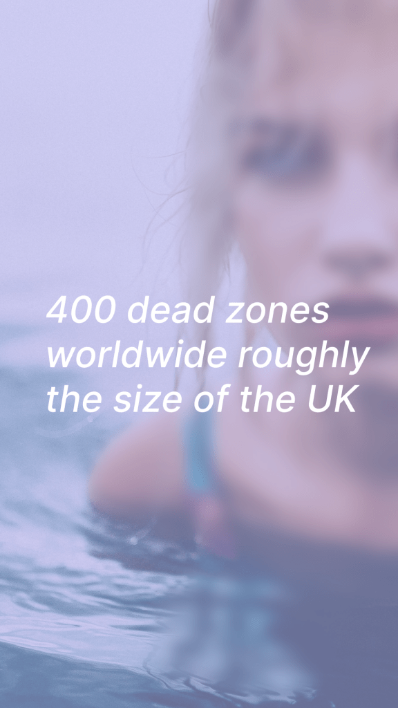
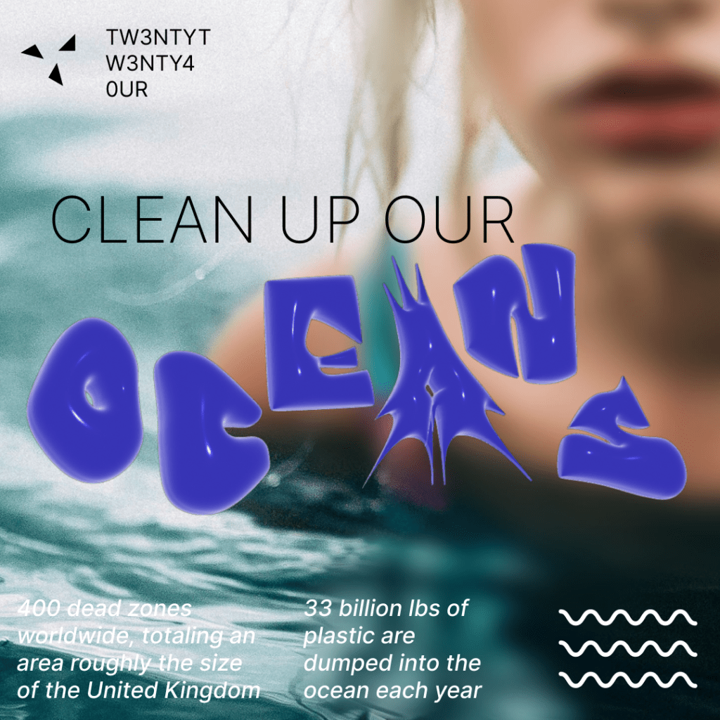
The research I focused on was widely available and easy to access. The UN publishes lots of interesting research ranging from pollution to fishing practices to the biodiversity created by a thriving ocean making the importance of this project very clear.
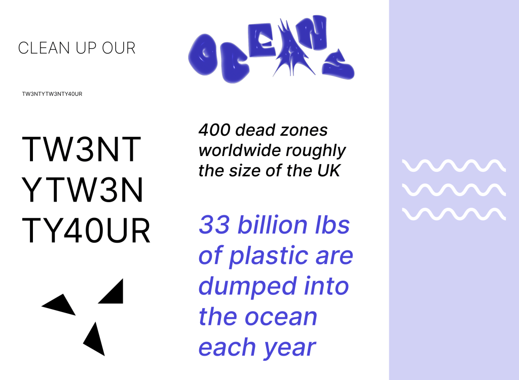
Oceans are home to a vast array of marine life, from the smallest plankton to the largest whales. Clean oceans support healthy ecosystems, which in turn sustain biodiversity. When oceans are polluted, it can harm or even destroy habitats, leading to a decline in marine species.
Oceans are a vital part of the global economy, supporting industries such as fishing, shipping, tourism, and recreation. Clean oceans contribute to a thriving marine economy, providing jobs and economic opportunities for communities around the world.
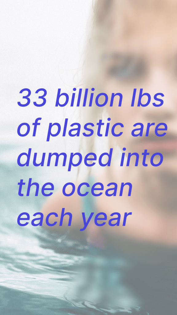
Oceans play a crucial role in regulating the Earth’s climate. They absorb large amounts of carbon dioxide, helping to mitigate climate change. Healthy oceans are better able to perform this function, whereas polluted oceans can release harmful greenhouse gases and exacerbate climate change.
RESEARCH:
On a technical level I focused on using illustration, photography and 3D renders to create a mixed media exciting visual. This process led me into lots of interesting experiments which evolved into the various media deliverables.
CHALLENEGES:
Keeping the campaign cohesive while maintaining different media forms and platform constraints forced a creative approach to constructions and deconstruction of the visual identity. Finding a fresh perspective on the visual identity of sustainability so that I could maintain the audience’s interest while holding true to the importance and essence of the oceans.
Design Approach/Strategy:
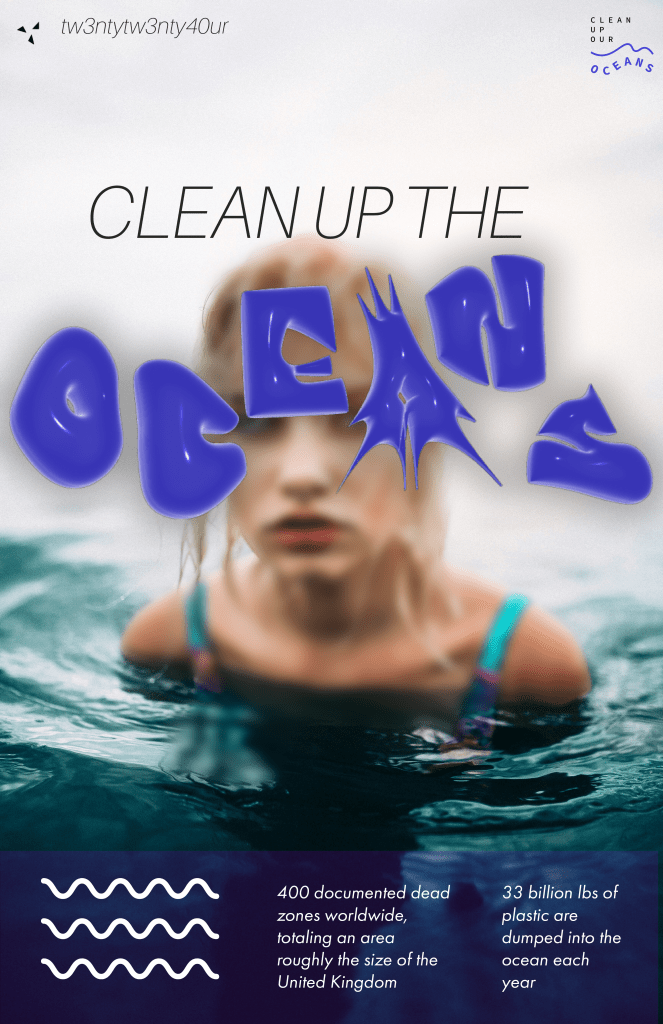
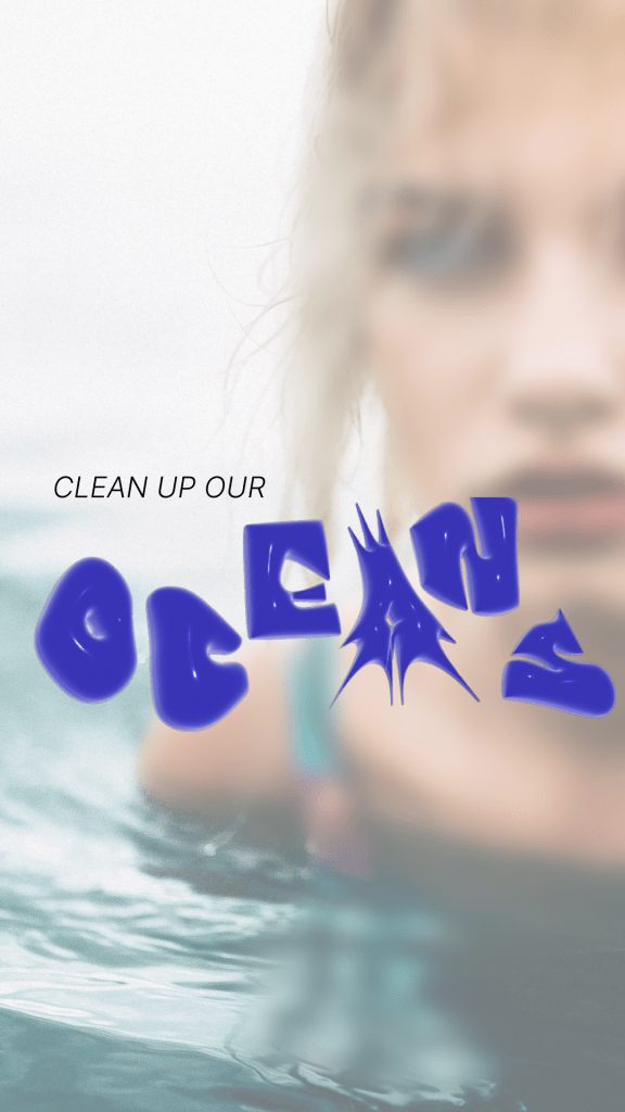
The largest challenge for me was to break away from what I find to be a very predictable visual identity of sustainability themes. I drew inspiration from punk rock, Y2K cyberism, and abstract art. The juxtaposition of simple elements and chaotic composition feel very representative of the ocean. A big mix. Underlying the whole project is this purple and wavy feel which really well evoked the essence of the ocean.
Repetition, Balance, Contrast were tools I focused heavily on to create something busy and yet clear.
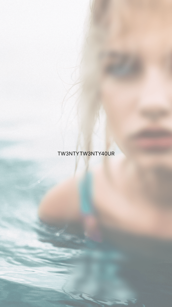
Many of the visual elements were created in illustrator which allowed me the freedom to really dial in the shapes while allowing for full scalability. The 3D shapes were all created using illustrators extrusion. The image of the girl in water is intended to draw the audience into the images, into the work through attention and relation.